Thomas Williams & Co.
From 2015, Thomas has worked with clients across Australia and North America on product, brand, and strategy projects. In 2021, after a 6-year tenure as Vice President of Design at The Wall Street Journal, Thomas shifted to working full time with his design consultancy, Thomas Williams & Co.
Thomas' work is focused on creating products and experiences that add value and have lasting positive impact for their users. Thomas has worked with my clients to launch new products, uncover user needs and audience insights, define strategic vision and secure funding.
CAPI
Brand Identity
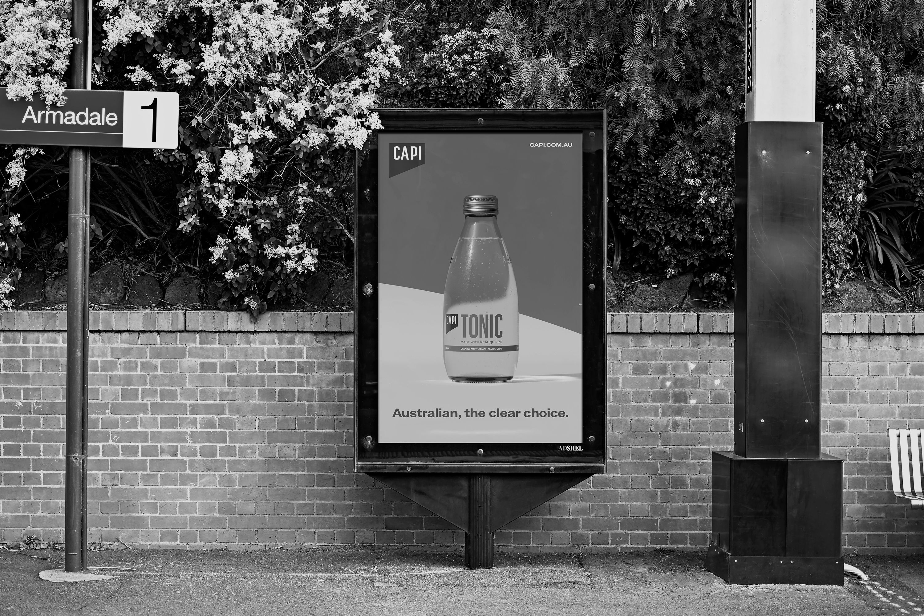
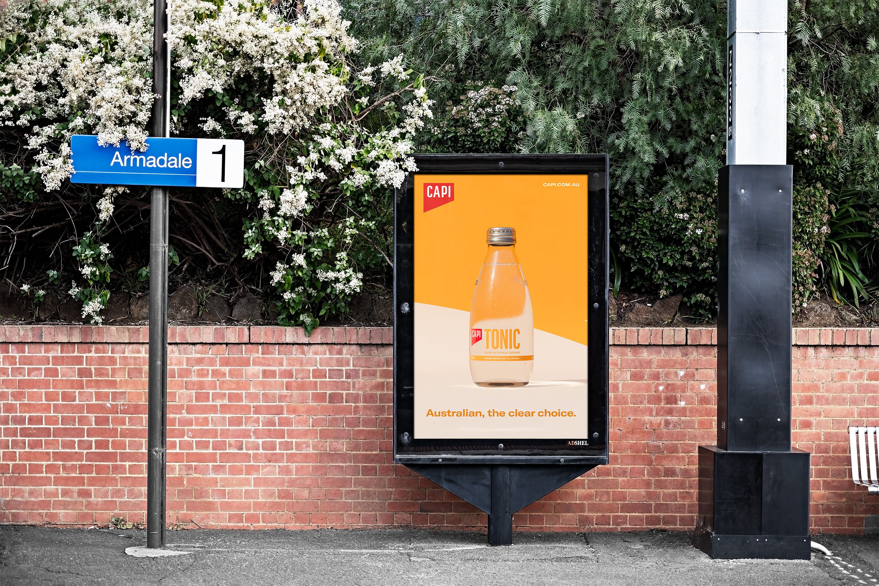
Founded in 2012, CAPI is an Australian manufacturer of 100% natural waters, sodas, and beverages. CAPI is a family-owned business with conscience that cares about the world around us and is dedicated to crafting products with natural, local ingredients. In the company’s words, CAPI ‘challenges a world of mass-production and mediocrity’.
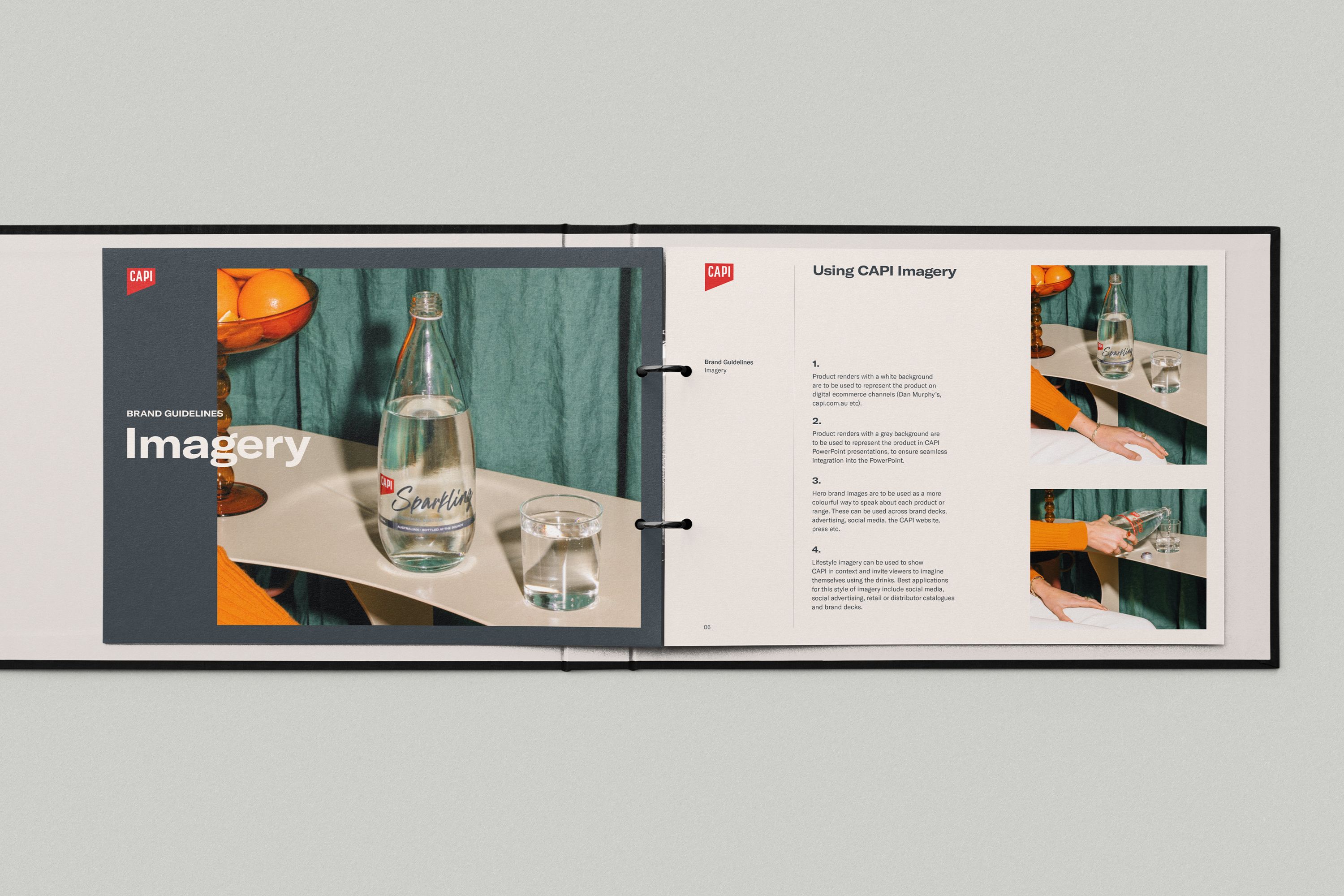
Thomas was engaged to work with the team at CAPI to further develop their core brand identity and strategy. Working with their existing brand mark, Thomas worked to develop design systems and frameworks across all of the brand’s touchpoints. These included brand guidelines, portfolios, social media, digital assets, product development, and more.
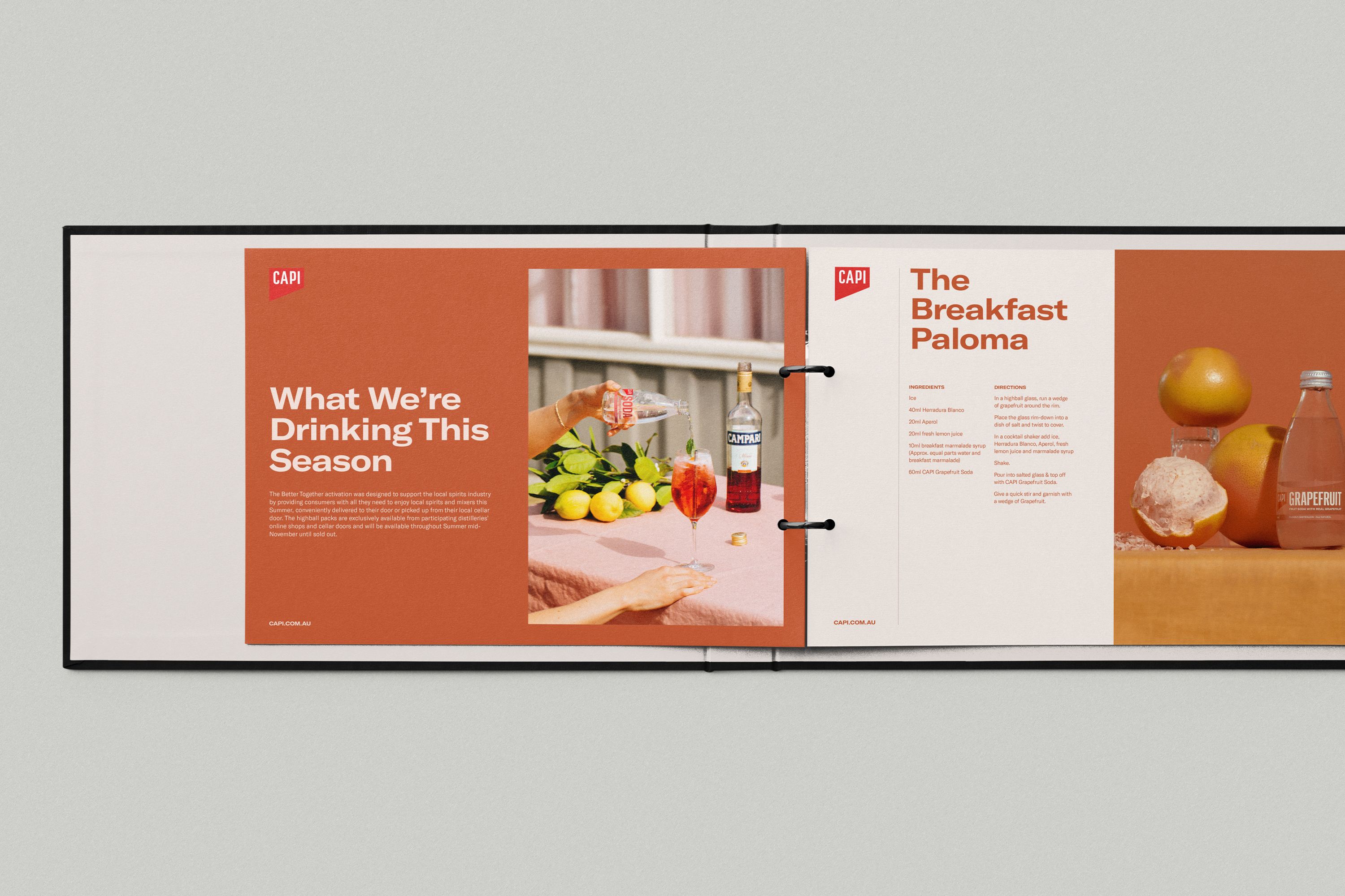
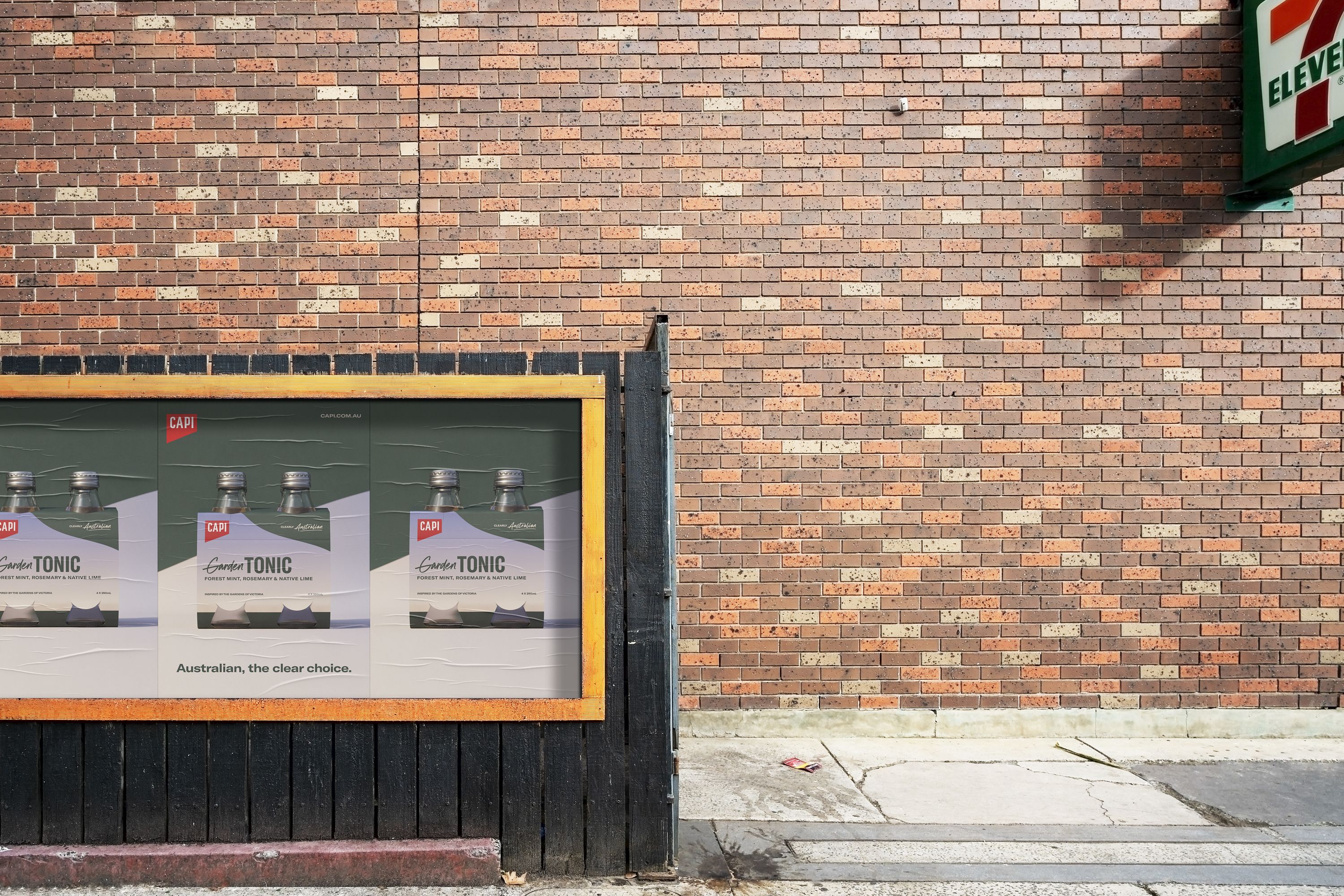
In addition to the core brand requirements, Thomas has also worked on positioning and campaign development for CAPI’s ‘Clearly Australian’ initiative. Advocating for all natural and locally sourced and produced products, the campaign aimed to raise awareness around CAPI’s unique position in the Australian market.
Violet
App
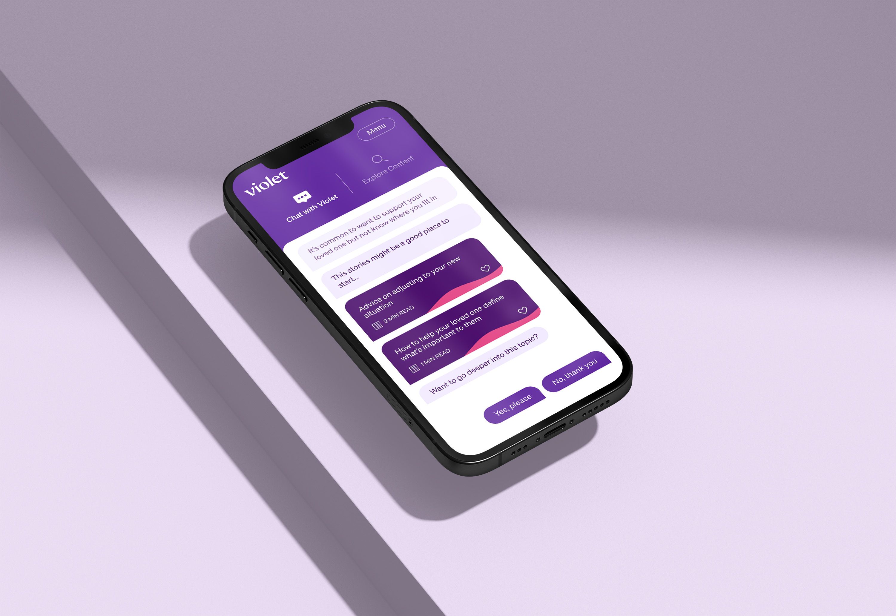
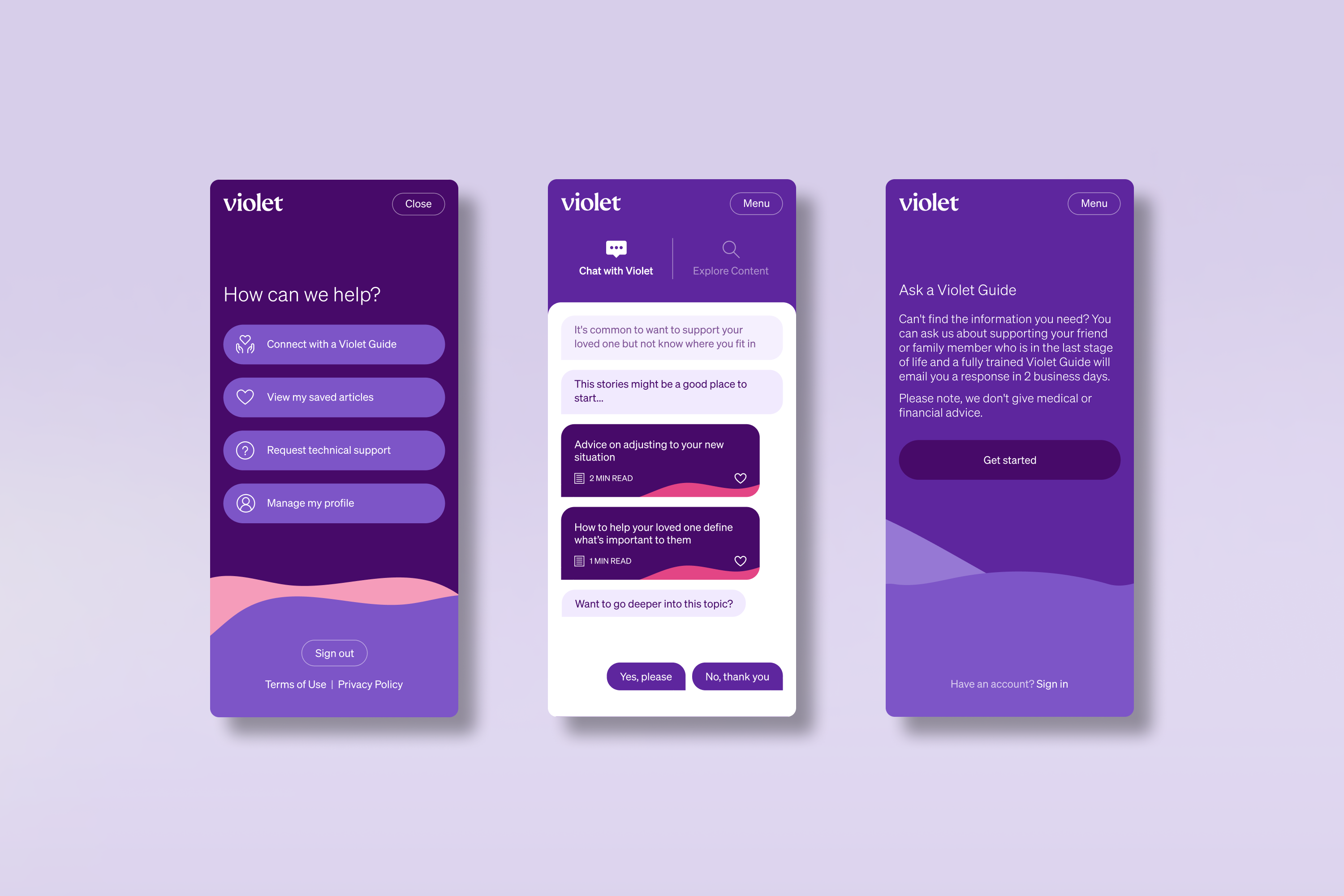
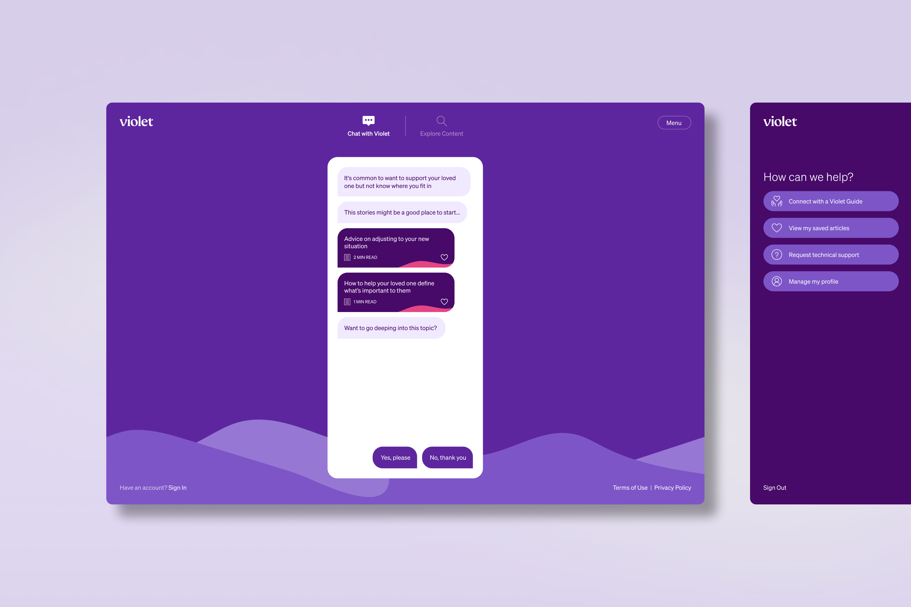
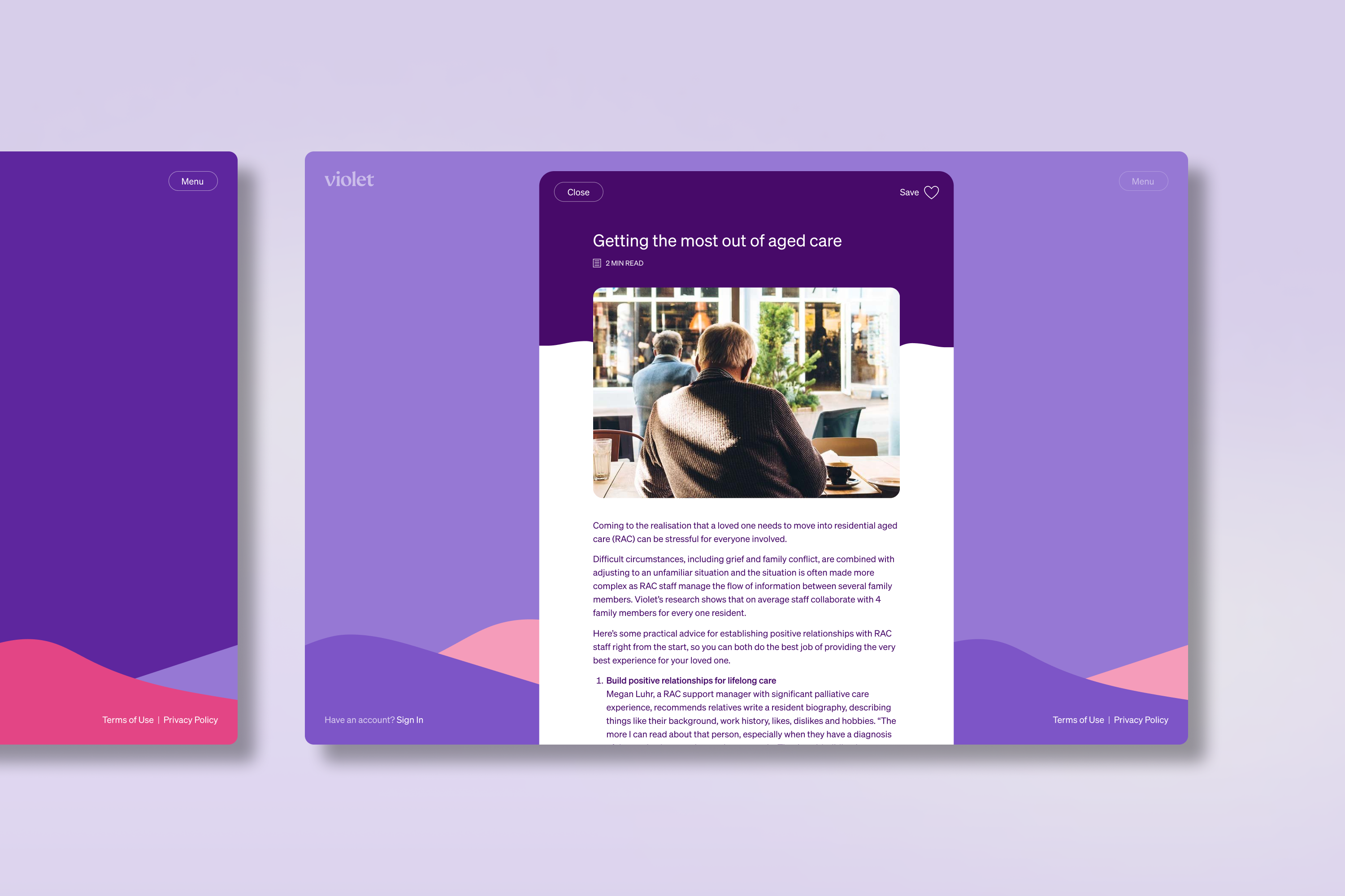
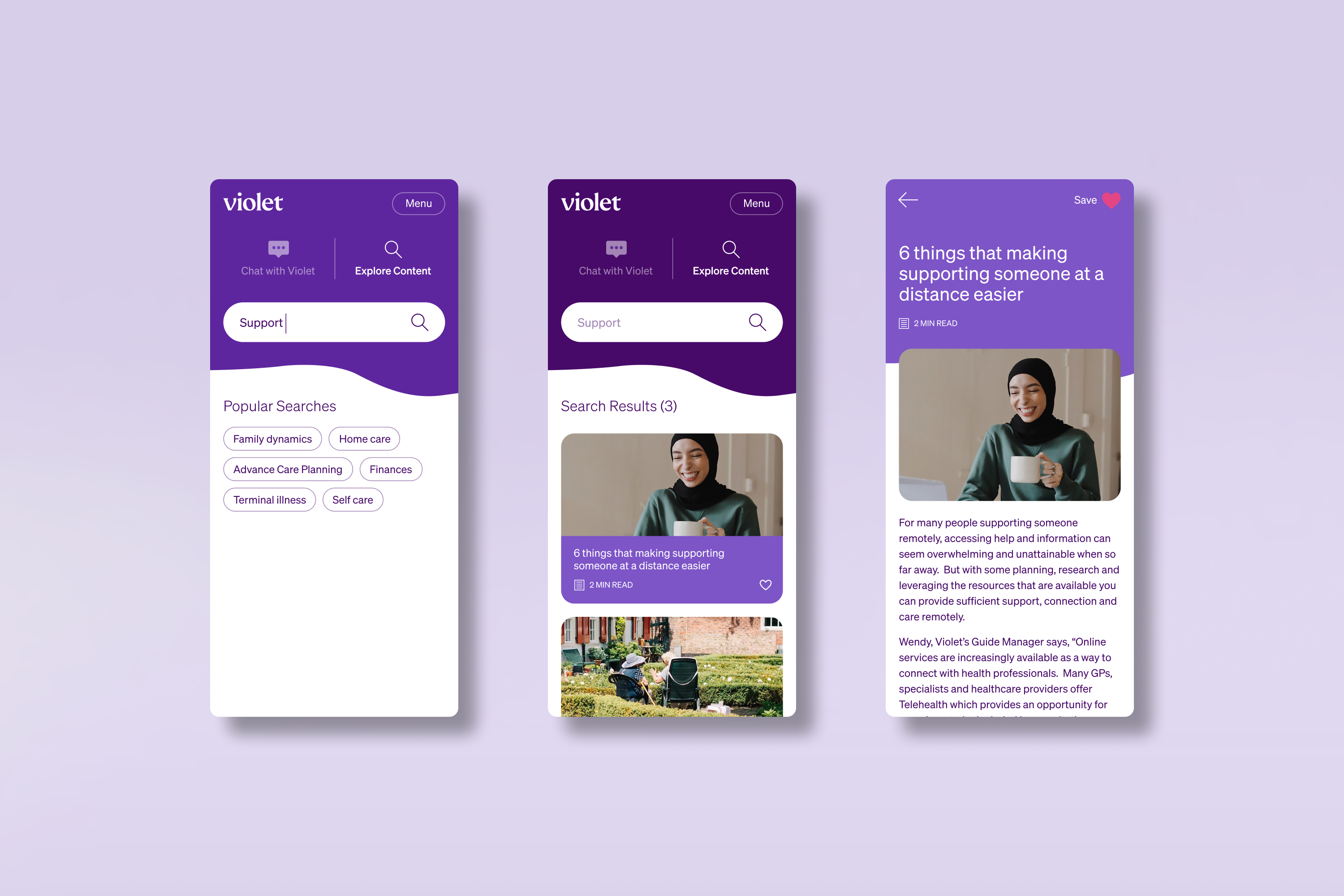
Violet is an Australian not-for-profit that provides support and guidance for those navigating the last stages of life, and the challenges that accompany it. Thomas worked closely with the team at Violet to design and prototype a new digital product, Violet Companion. In a conversational chat interface, the app connects people with practical and insightful content, based on their specific needs, challenges, and circumstances.
The project worked through an accelerated program that included design ideation, rapid prototyping, and qualitative user testing. Within 8 weeks, Violet Companion went from an idea to a working product that was informed by multiple rounds of iteration and user feedback.
Violet Companion has proven to be a great example of how new digital products can follow an agile validation process, and be in the hands of users at the early stages of product development.
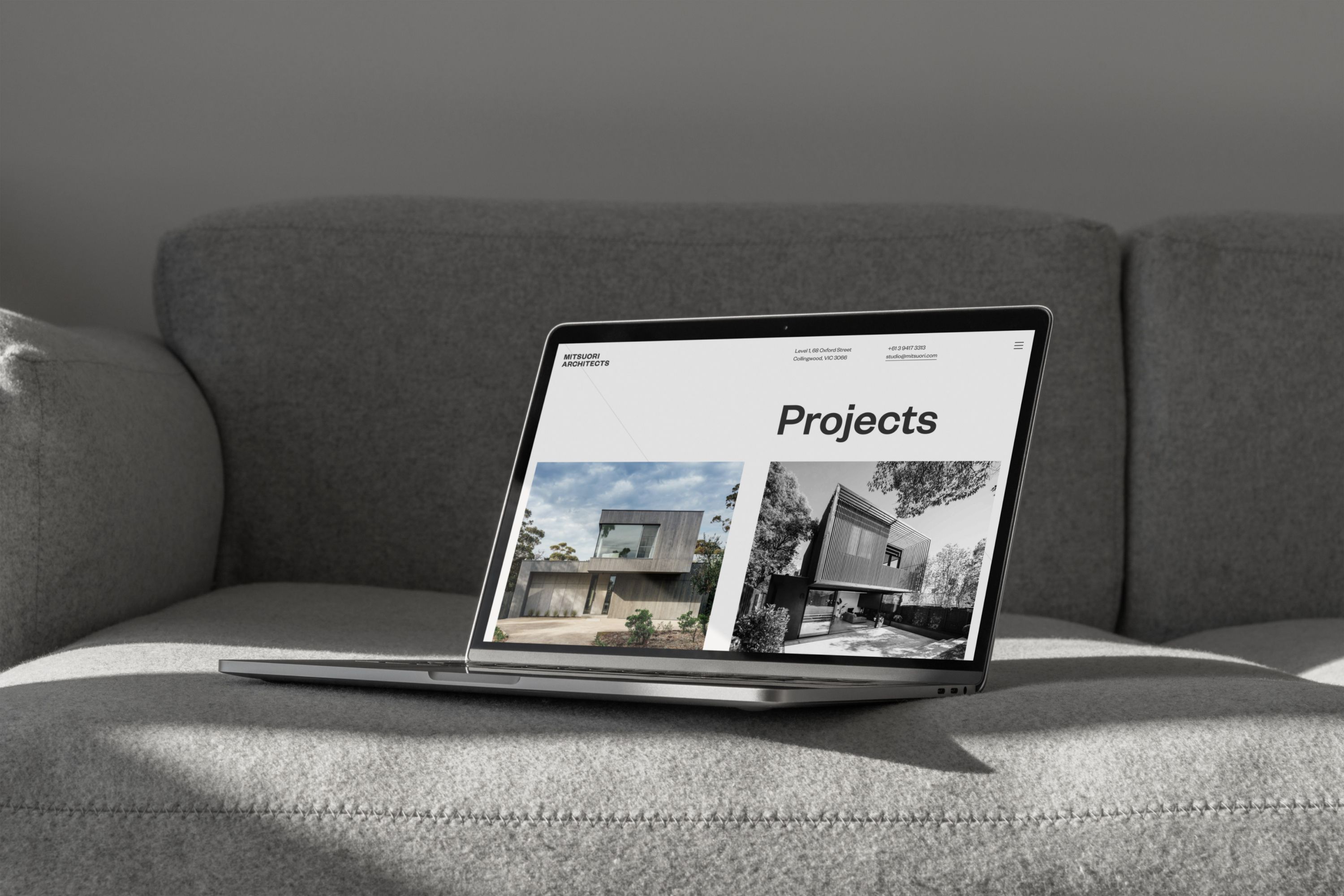
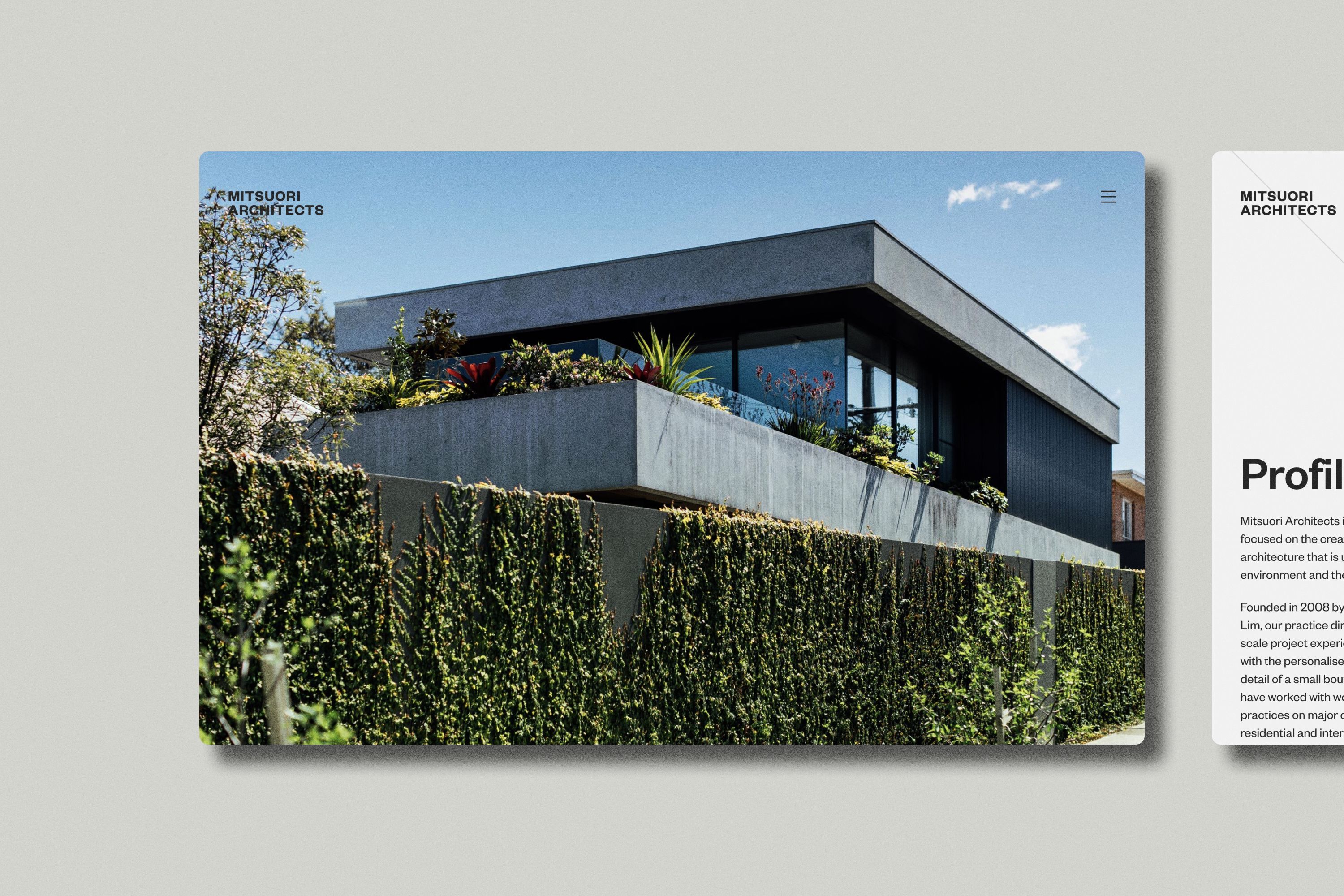
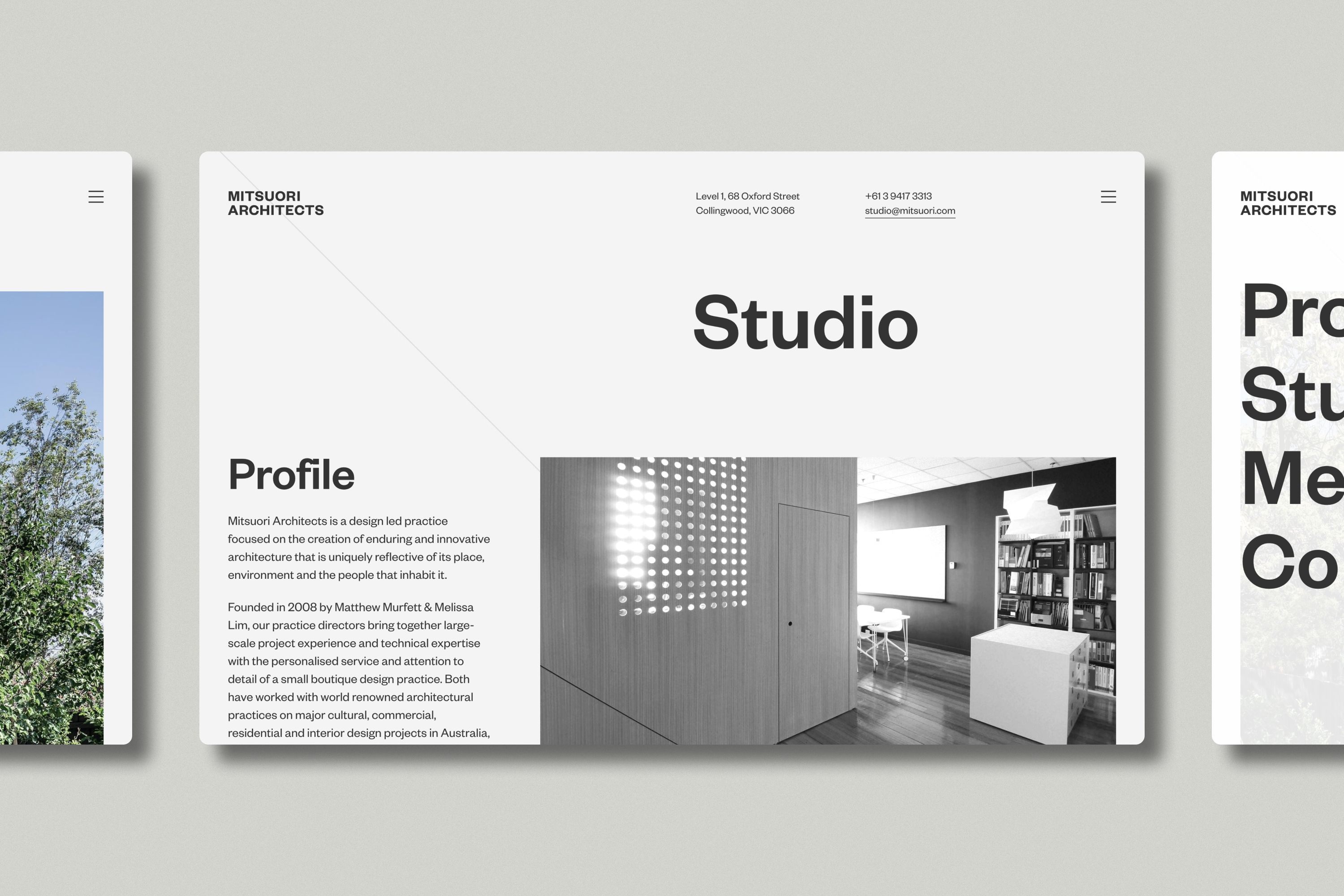
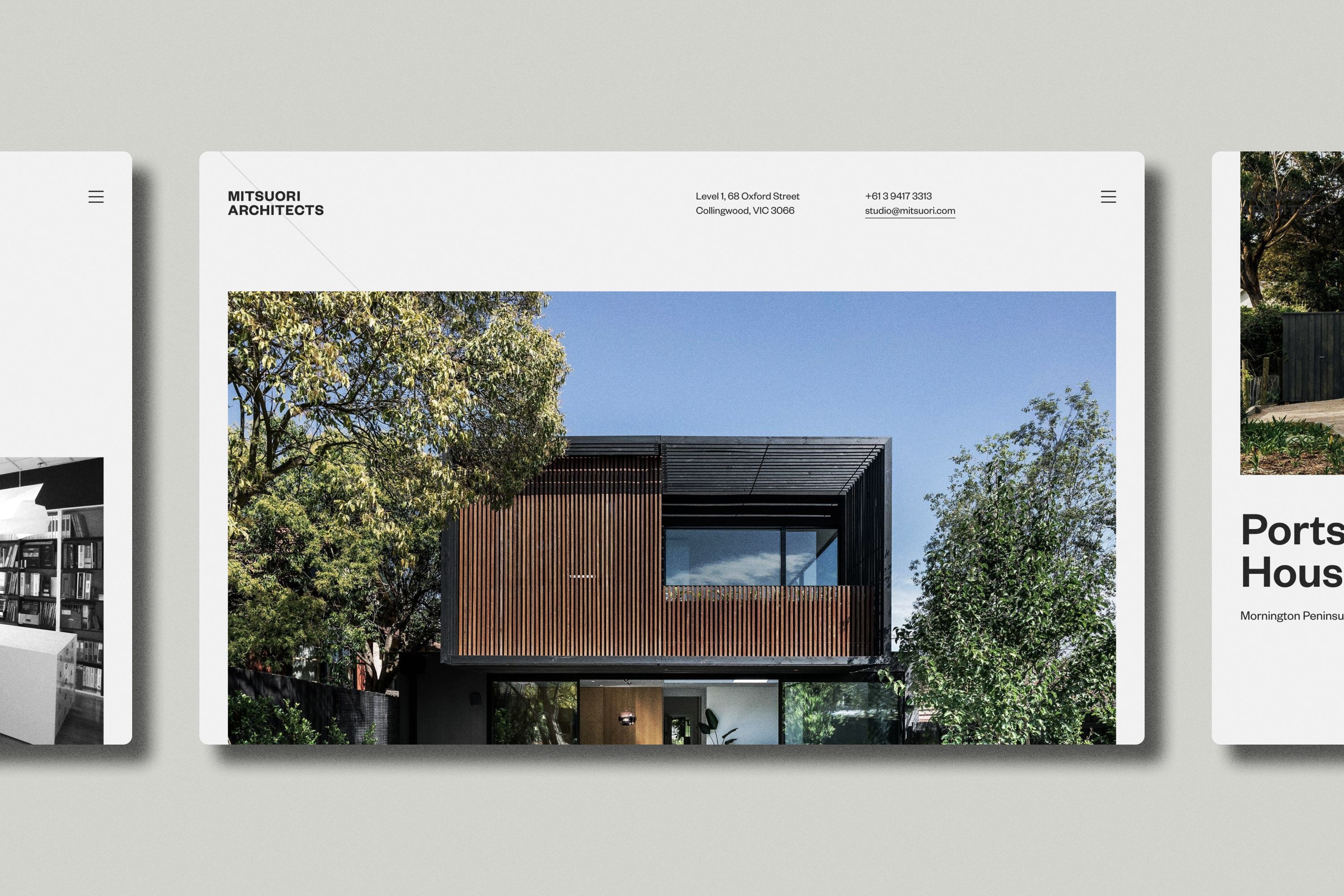
Mitsuori Architects
Website
Taking its name from a Japanese term meaning ‘threefold’, Mitsuori is a boutique Melbourne-based architecture studio. Thomas originally created the Mitsuori brand identity over a decade ago, which has stood the test of time. Building further on this, the studio engaged Thomas to design and develop a new responsive website to showcase their architectural portfolio.
The site design adheres to a responsive grid system that provides the user with an optimal experience on any device, from smartphone to desktop. Paired with bold san serif typography (Klim Type Foundry’s Founders Grotesk), the site remains true to the original brand’s creative intent and translates it into a modern digital context.

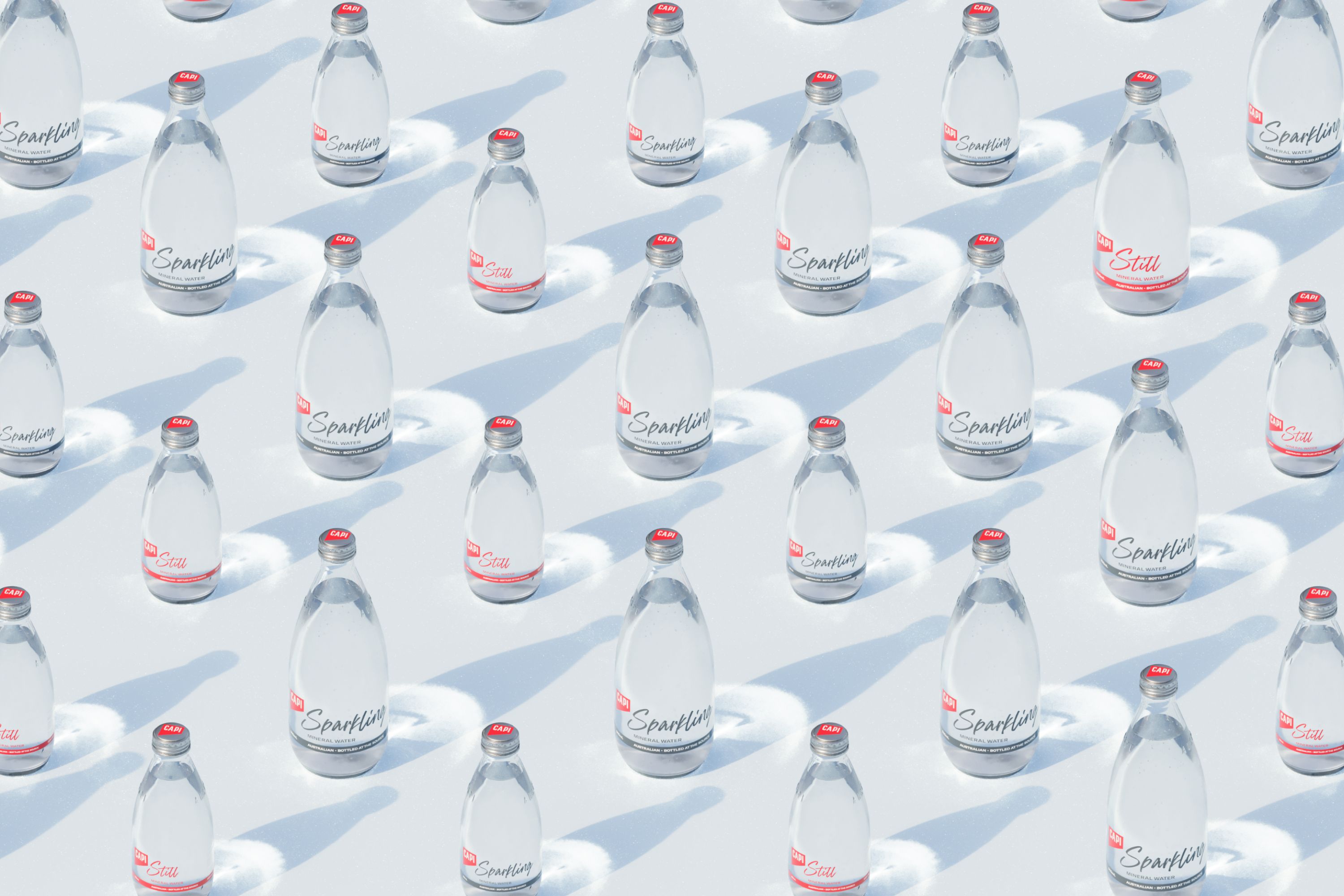
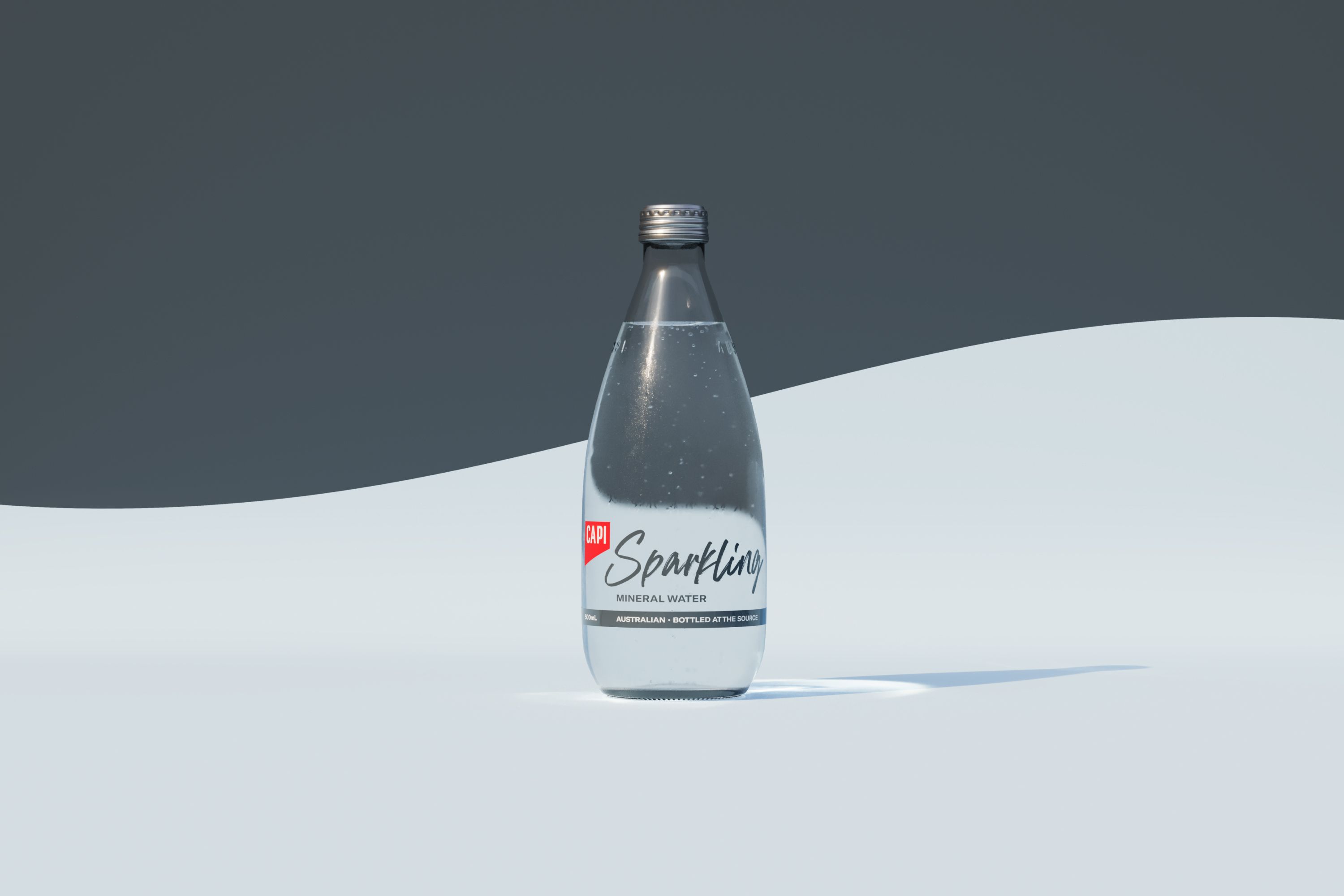
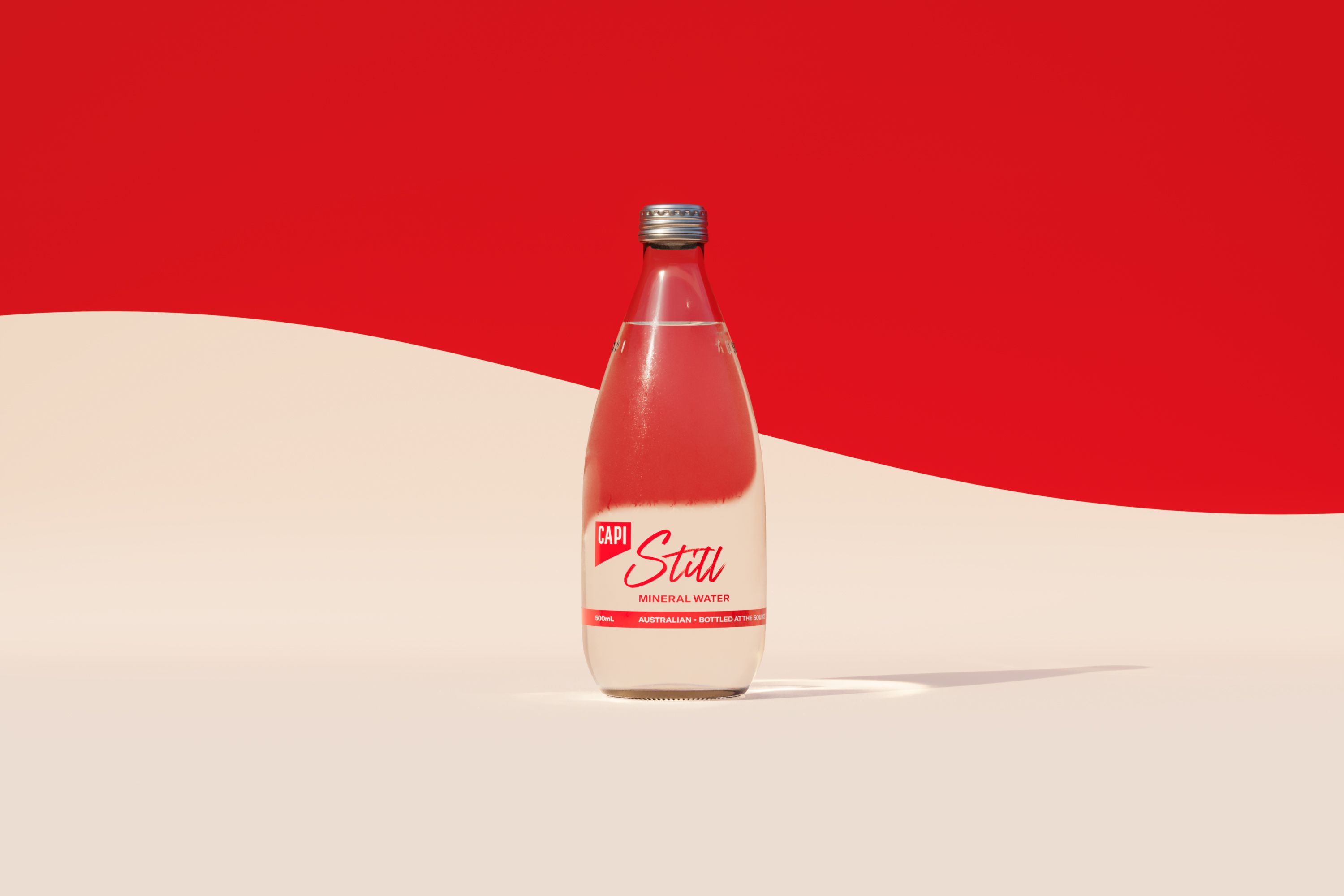
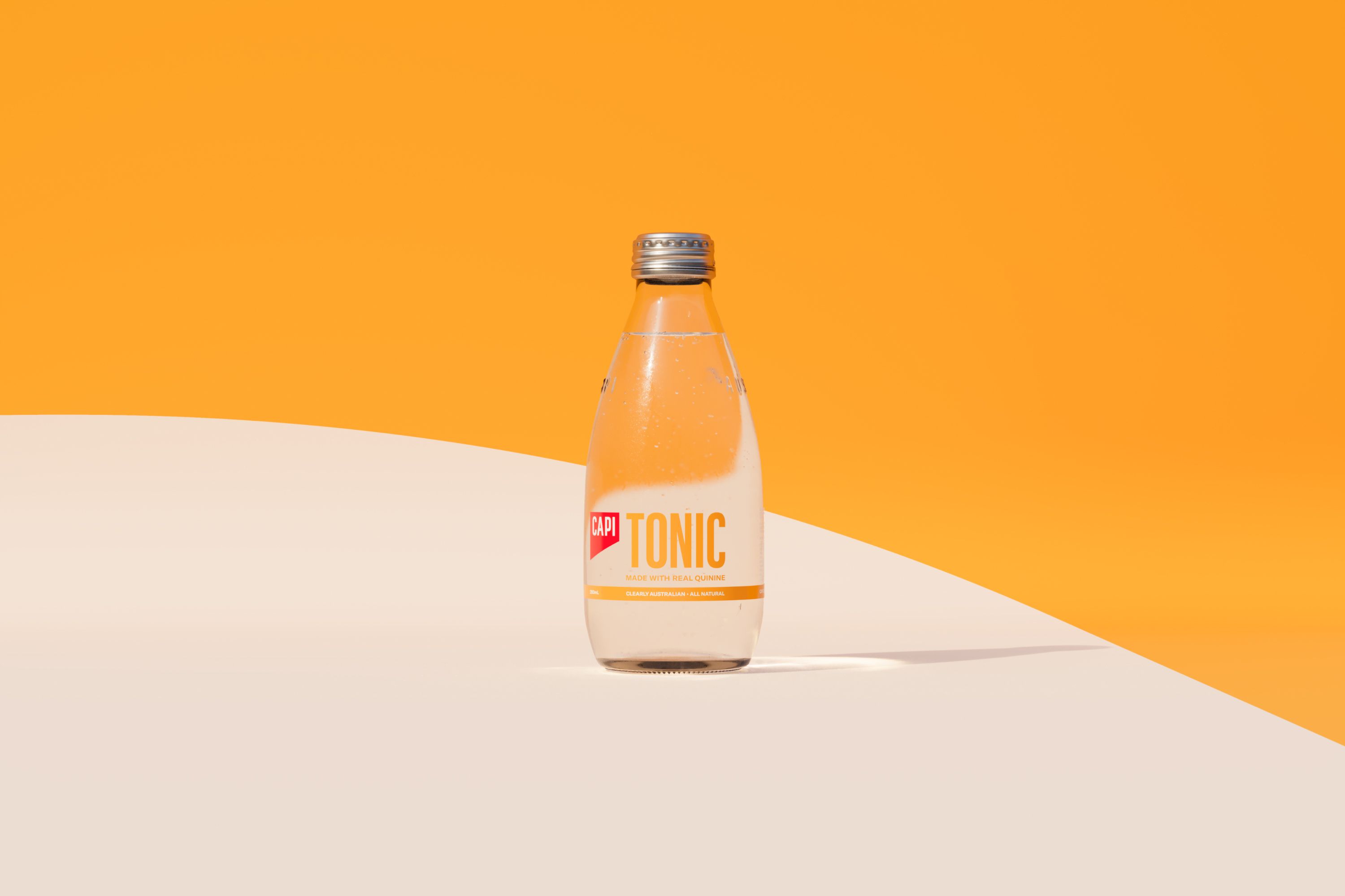
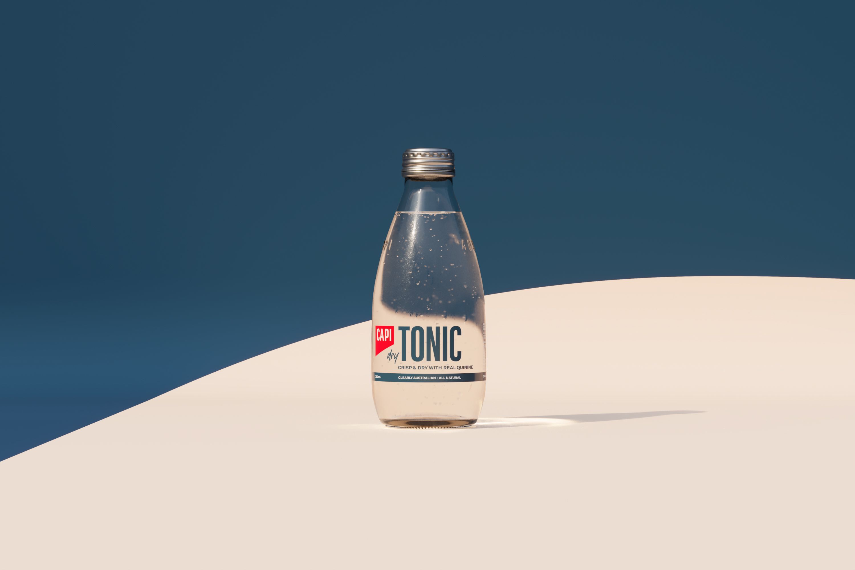
CAPI
Packaging
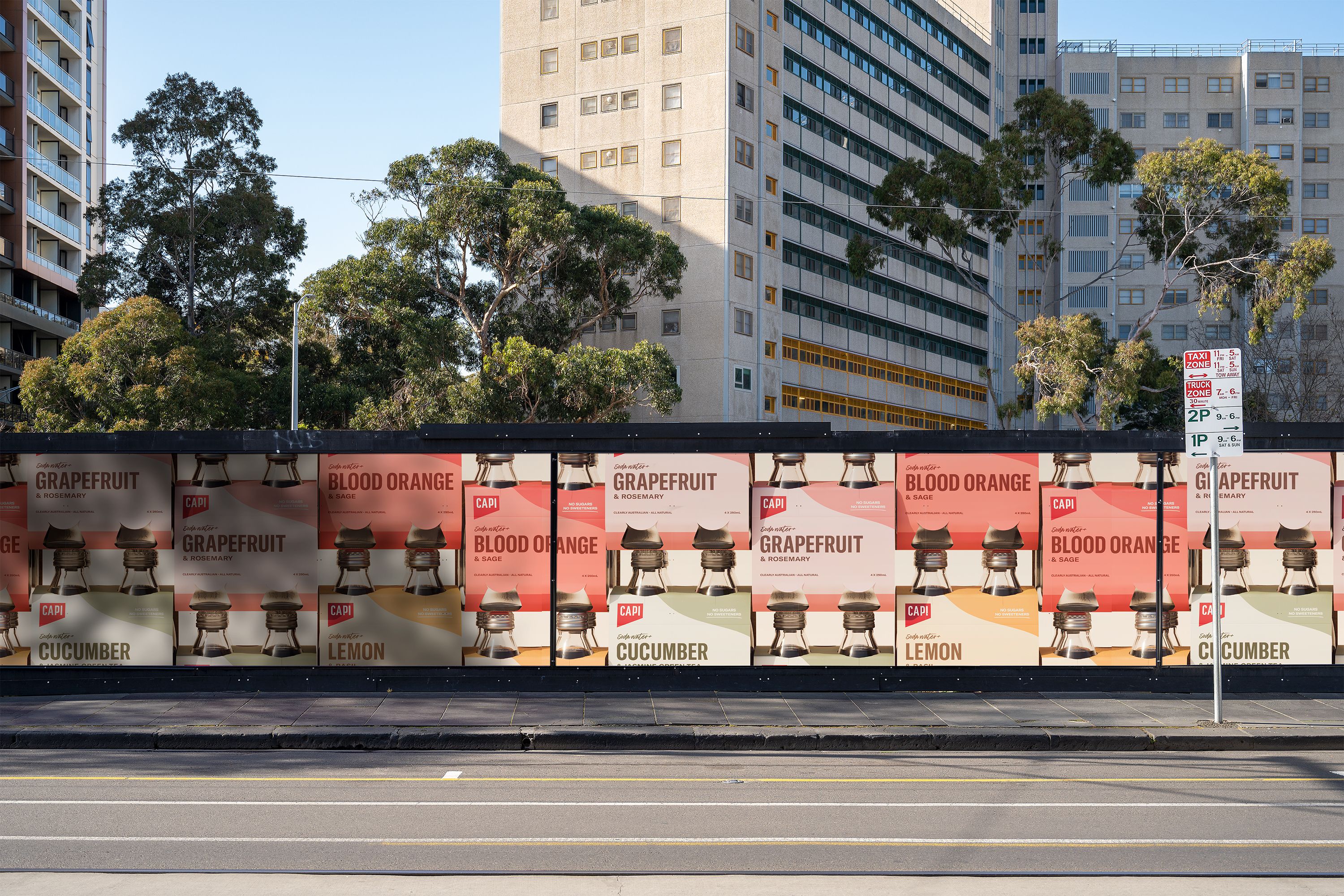
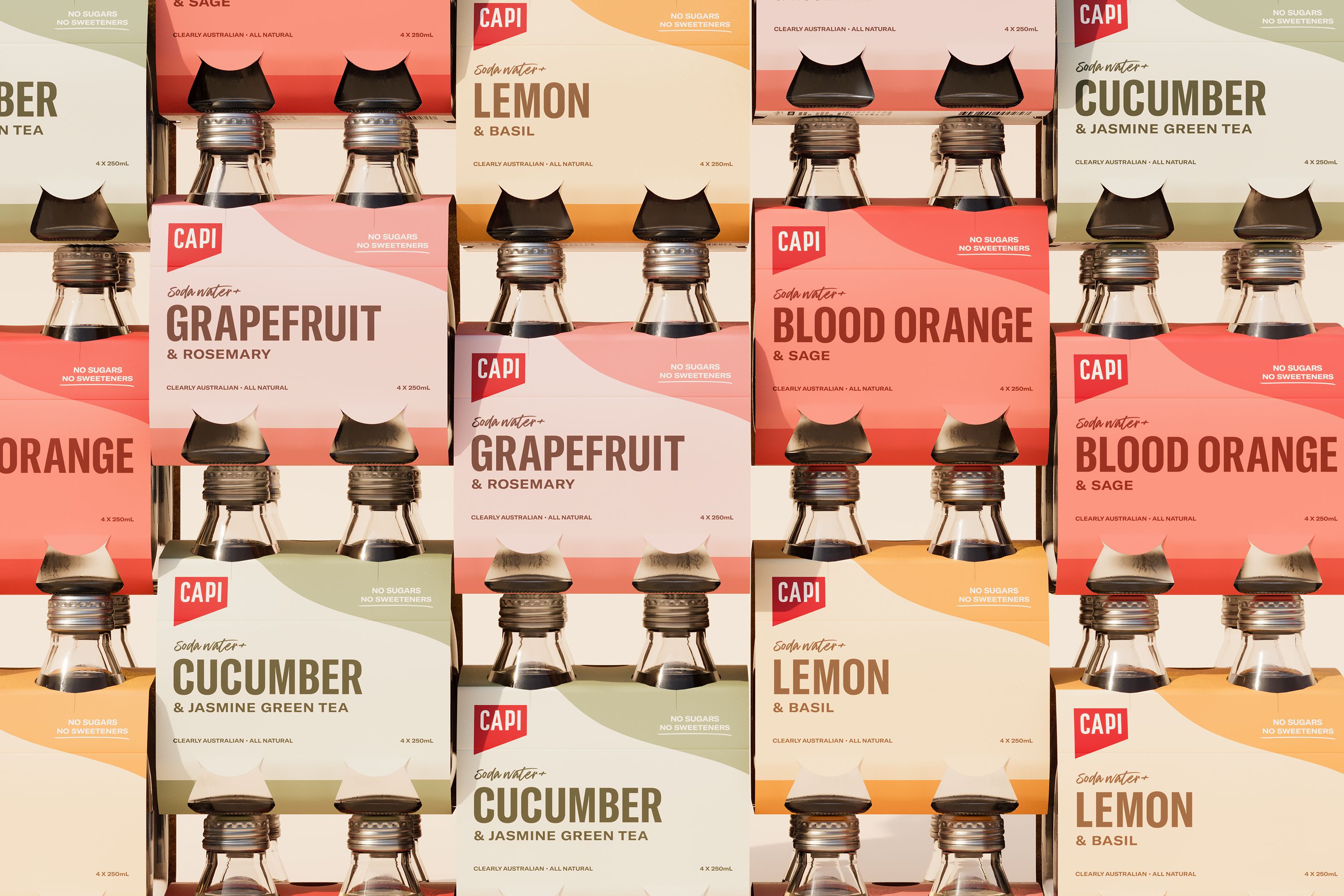
As an extension of CAPI’s brand identity, Thomas has worked closely with the team to evolve and create a new design system, specifically for CAPI products. This has involved design development of over 20 products both for the existing range and several entirely new initiatives.
Each product includes design of bottles, cartons, and other packaging, all of which have sustainability at the forefront and are 100% recyclable. With a cohesive language across all products, the design system has been created with scalability in mind, enabling CAPI more rapidly to produce, validate, and bring new products to market. Thomas has taken an integrated approach working with the team at CAPI and has been involved in the end-to-end process of brand, product, and strategy.
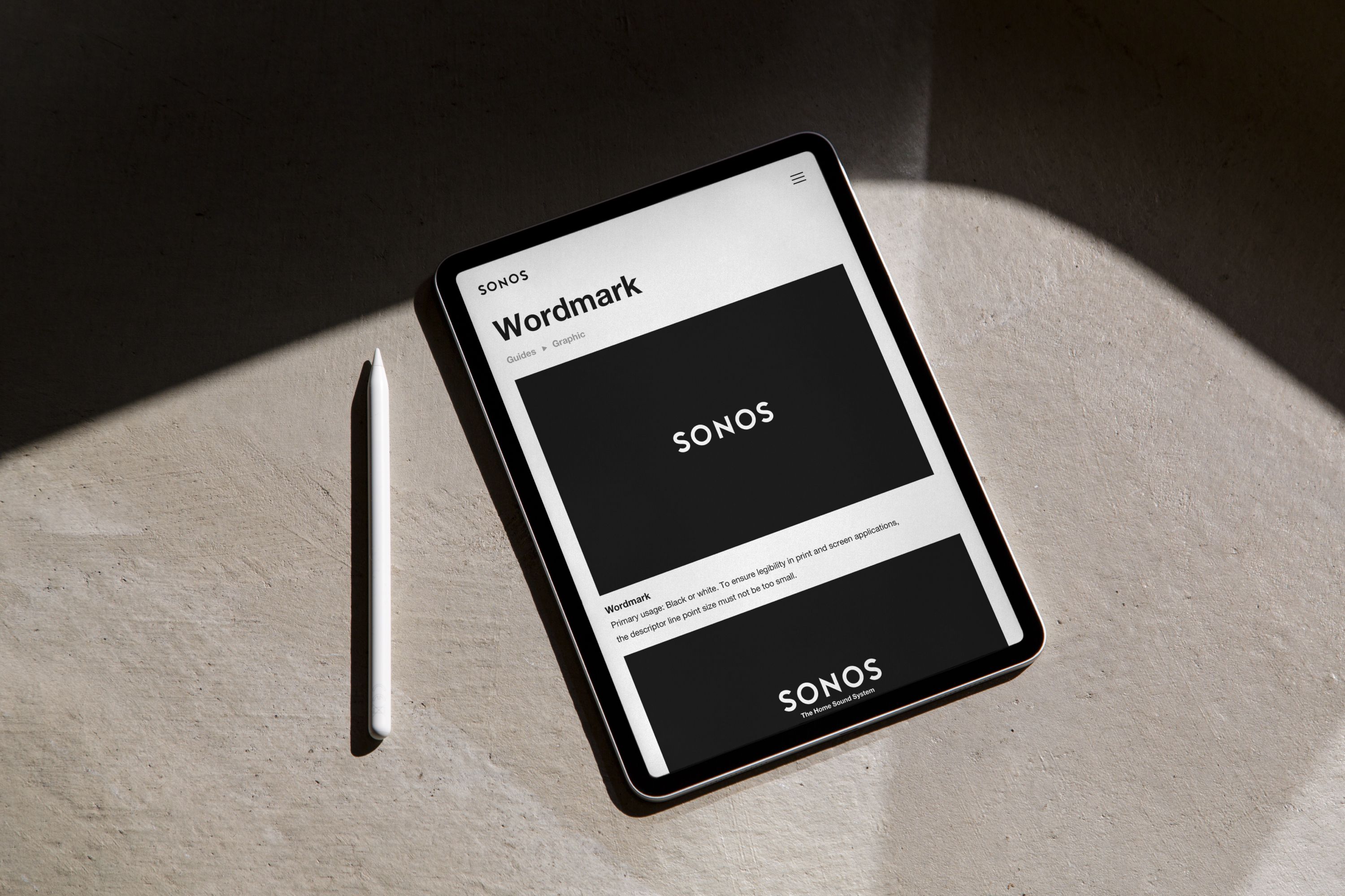
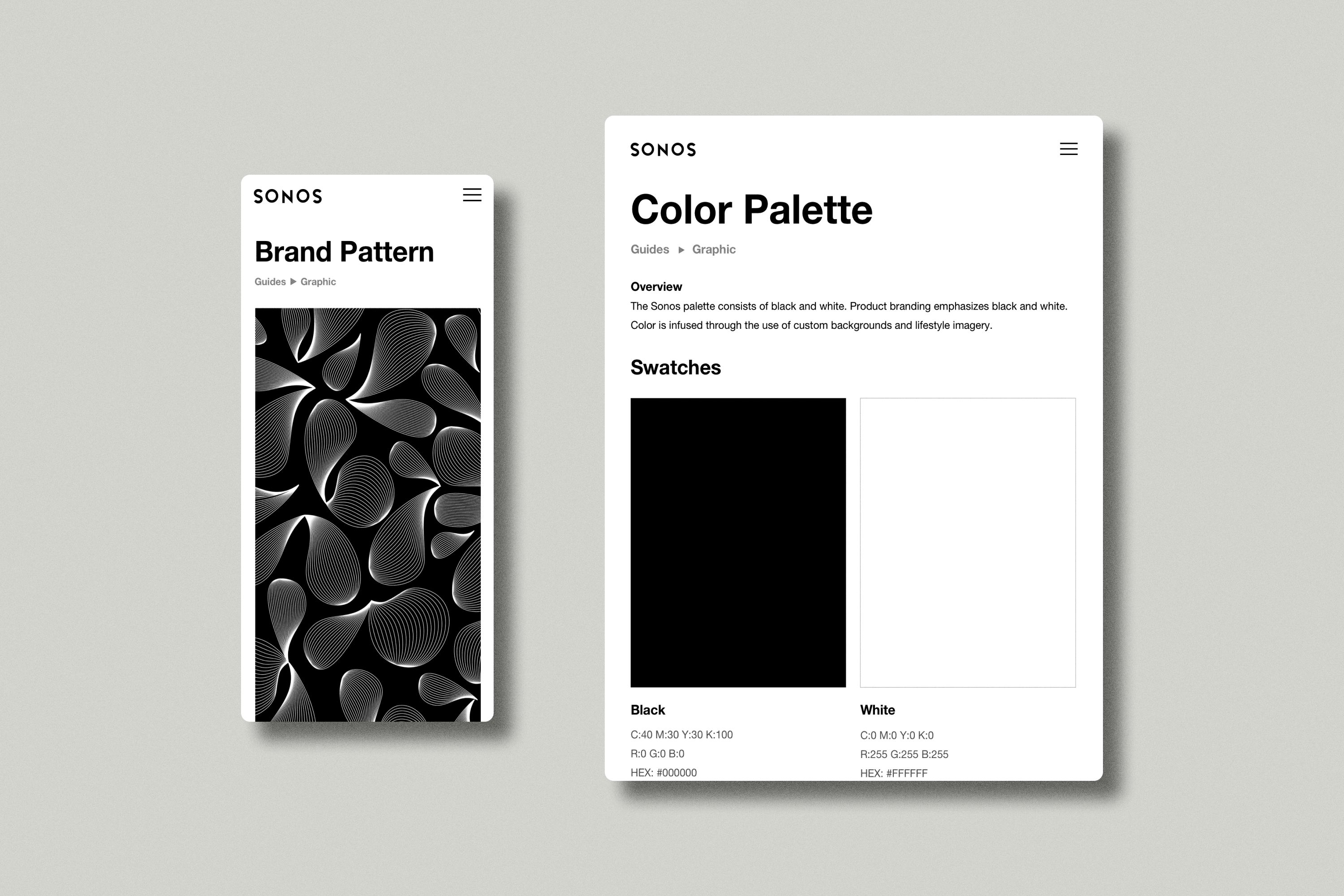
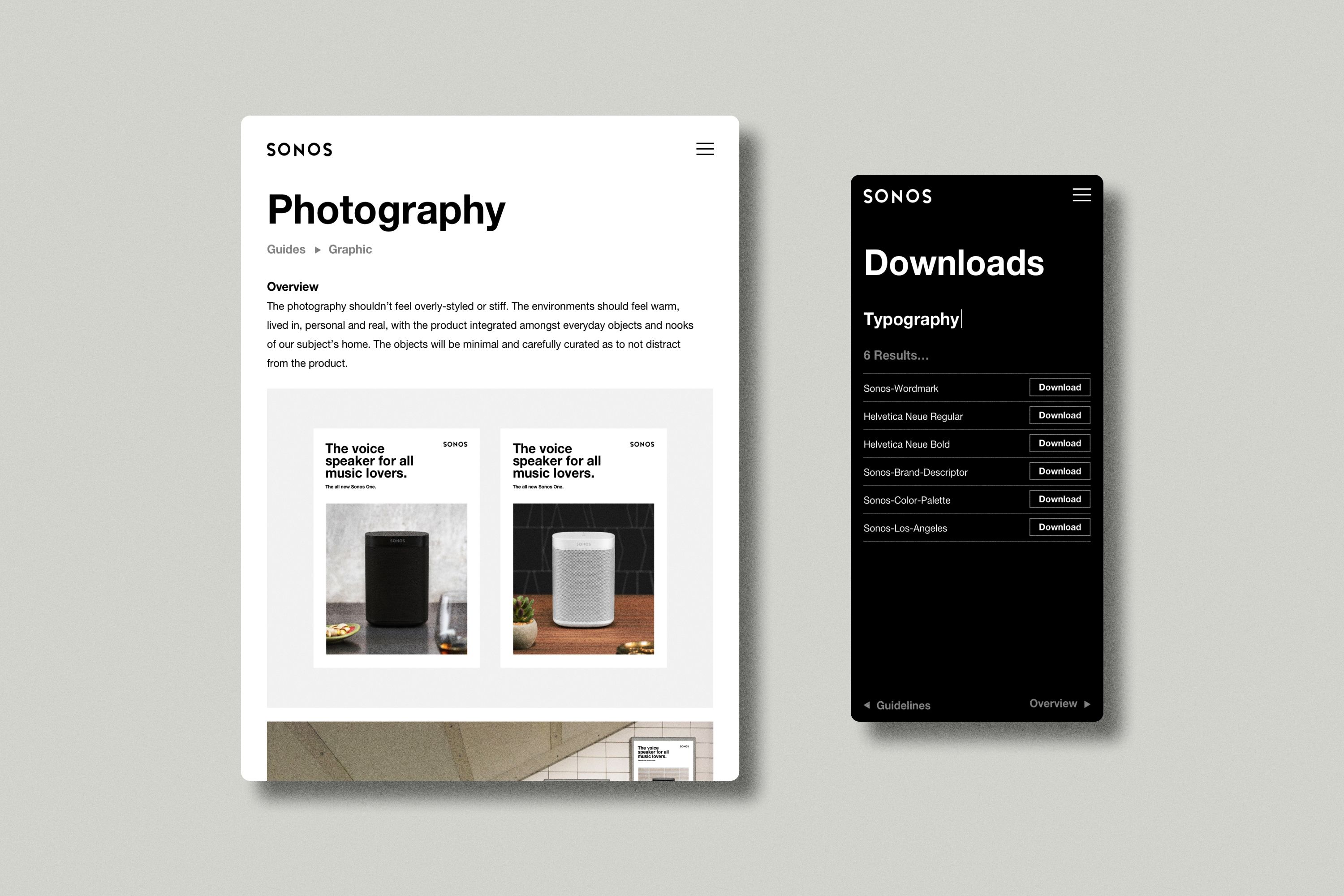
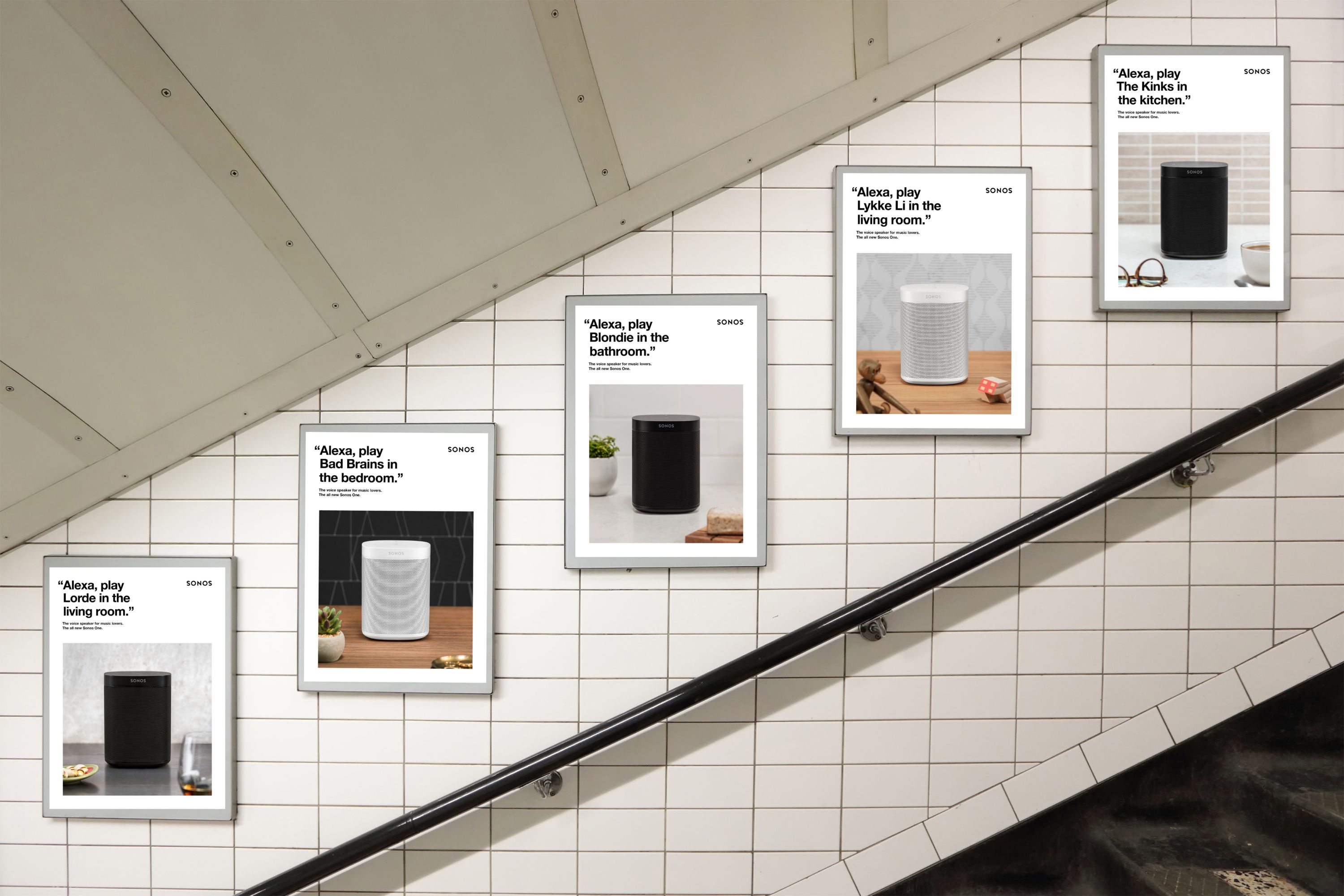
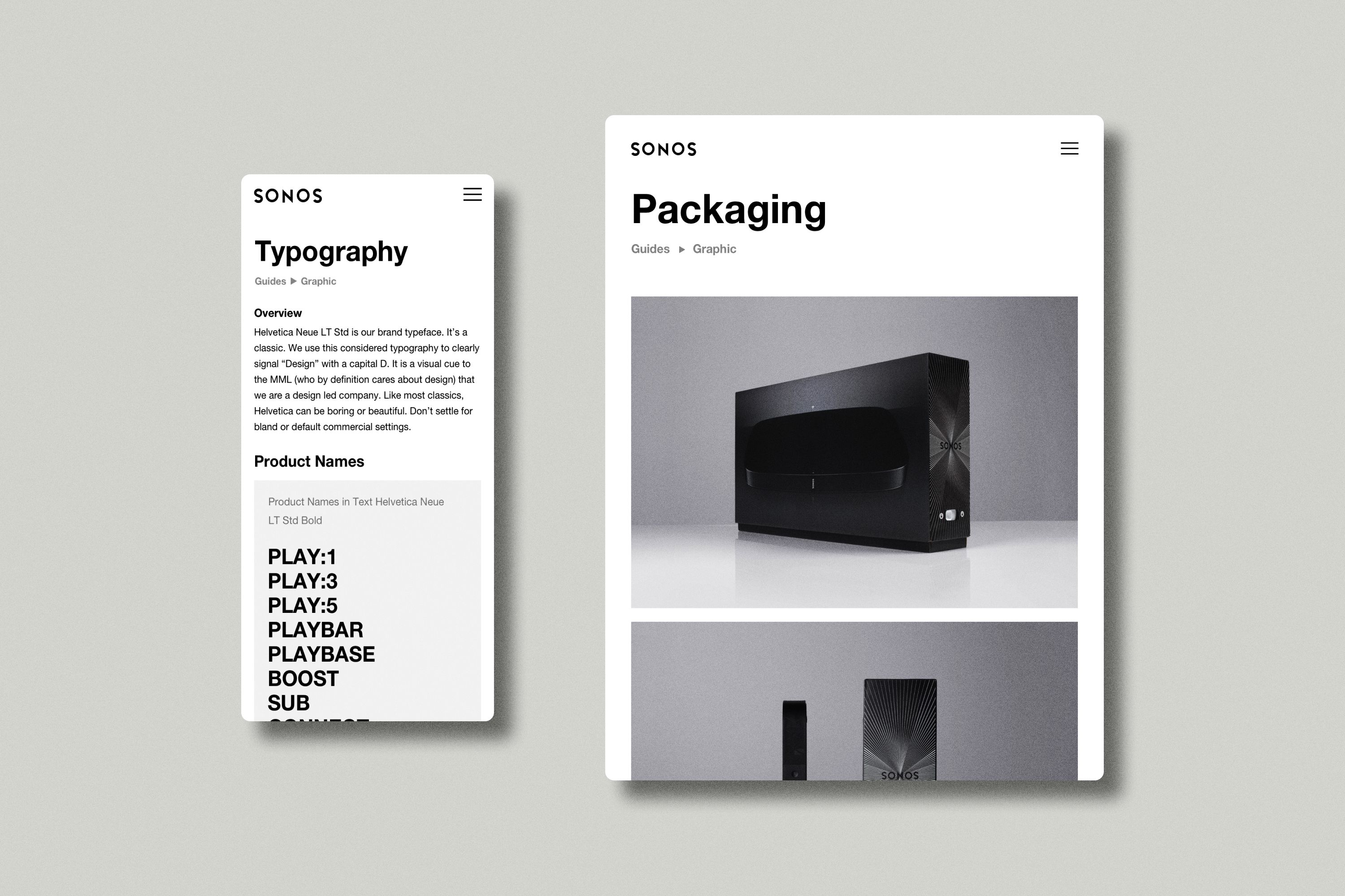
Sonos
Brand Guidelines
In collaboration with Los Angeles-based Hype Type Studio, Thomas worked on the design of a custom brand guidelines site for Sonos, the smart speaker and multi-room audio manufacturer. The site is used internally to manage brand assets and usage guidelines, including word mark, typography, photography, colour palette, and illustrations.
The site has been designed to be consistent with Sonos’s brand guidelines, specifically the approach to typography and user interfaces. It is completely responsive across all devices, including desktop, tablet, and smartphone. In addition to the brand guidelines, Thomas has worked on a number of other brand projects for SONOS, including packaging and corporate presentations.
Fun Fact: The word ‘Sonos’ is a palindrome and always reads correctly regardless of its orientation. The branding on many Sonos products takes advantage of this.
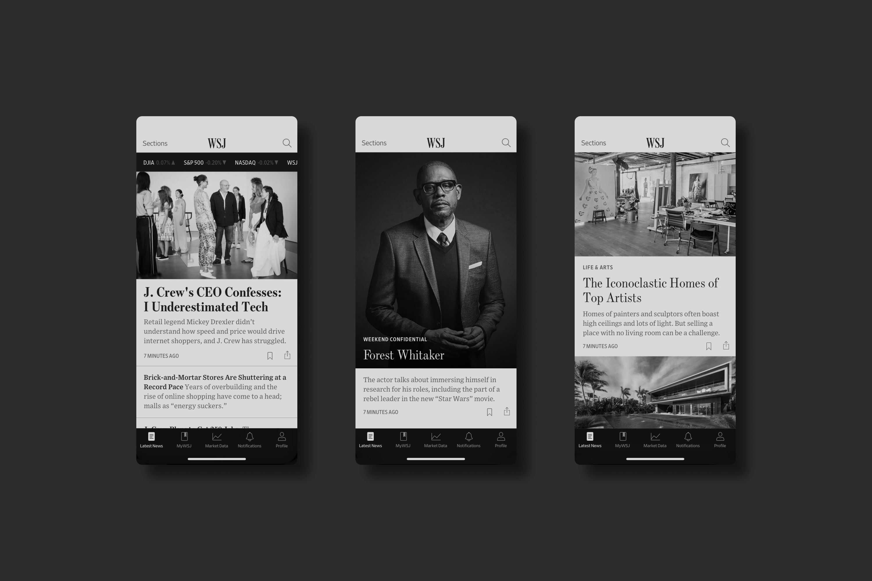
Thomas is a design and product leader with 16 years of experience creating user-centric products for global brands such as Apple, Sonos and The Wall Street Journal, as well as many startups and small businesses.
Thomas is currently working with clients across Australia and North America. To learn more about Thomas’s work or discuss a new project, please get in touch.
hello@thomaswilliams.co